| The project | |
|---|---|
| Client: | Semihandmade |
| Industry: | Interior design |
| Solution: | Shopify Plus |
| Year: | 2019 |
| Visit the Website | |
| What we did |
|---|
| Strategy, Design & Development |
| UX: Complexity made easy |
| UI: Full Custom |
| Shopify Plus: Full Custom theme |
TL;DR(?)
Semihandmade, an interior design company renowned for its custom doors compatible with IKEA cabinets, partnered with Bluedge USA to transform its extensive 30,000-SKU catalog into a dynamic Shopify Plus e-commerce store. This overhaul enhanced user experience through intuitive navigation and advanced filtering, streamlining operations and boosting online sales.
Key Achievements:
- ✅ Custom Shopify Plus Implementation: Developed a tailored e-commerce website to handle a vast product range.
- ✅ Enhanced User Experience: Introduced intuitive navigation and a smart tagging system for efficient product filtering.
- ✅ Operational Efficiency: Streamlined backend processes, facilitating seamless inventory management and scalability.
Converting 30,000 SKUs with Shopify Plus
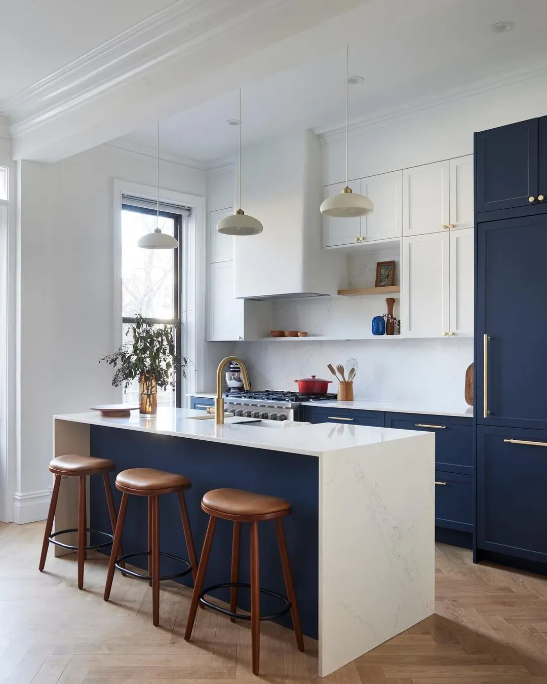
Semihandmade is an online e-commerce retailer that specializes in custom doors that fit Ikea kitchen and bathroom cabinets. They offer a multitude of designs, styles, and materials to help their customers build their dream kitchen.
The challenge of converting a catalog site into a fully functioning e-commerce platform was a daunting one for the semi-custom cabinetry company Semihandmade. Knowing they would need help to get it done, they turned to Bluedge USA. As Brian Wee, Director of Marketing for Semihandmade puts it, We were looking for an agency that were Shopify Plus experts. We knew we wanted to bring our entire product catalog of over 30,000 SKUs online and needed an agency to guide us through understanding the business objectives, challenges, and ways to get there. Over a 6-month long process, Bluedge USA would take Semihandmade's site from an idea to a fully realized shopping platform that is continuously evolving with their brand.
It started with a problem and an audit...
To best serve their growing business, Bluedge USA needed to fully understand Semihandmade's offerings and how their customers were using their website. By completing an audit, we were able to give insight into what they truly needed for their business, says Bluedge USA founder Nicolas Alessandra [Nico].
It was an important opportunity because, through this process, we had gained a unique knowledge of their products and offerings, and could make educated recommendations. As Brian of Semihandmade explains, they were able to bring up issues and solutions for things we didn't even consider at the beginning of the process. The problem was defined. All that was needed now was a solution.
Building a custom wireframe
First, you need the blueprints
One of the results of the audit was gaining an understanding of how the site needed to be organized to make sense of the customer's ordering experience. It was decided to wireframe the whole customer journey, redesigning it from top to bottom, and sharing it with Semihandmade to refine the end result.
As Nico details, We reorganized the entire site, including the product naming conventions, menu, structure, and imagery. All to help the consumer find the products they are looking for as seamlessly as possible, by following a more natural flow.
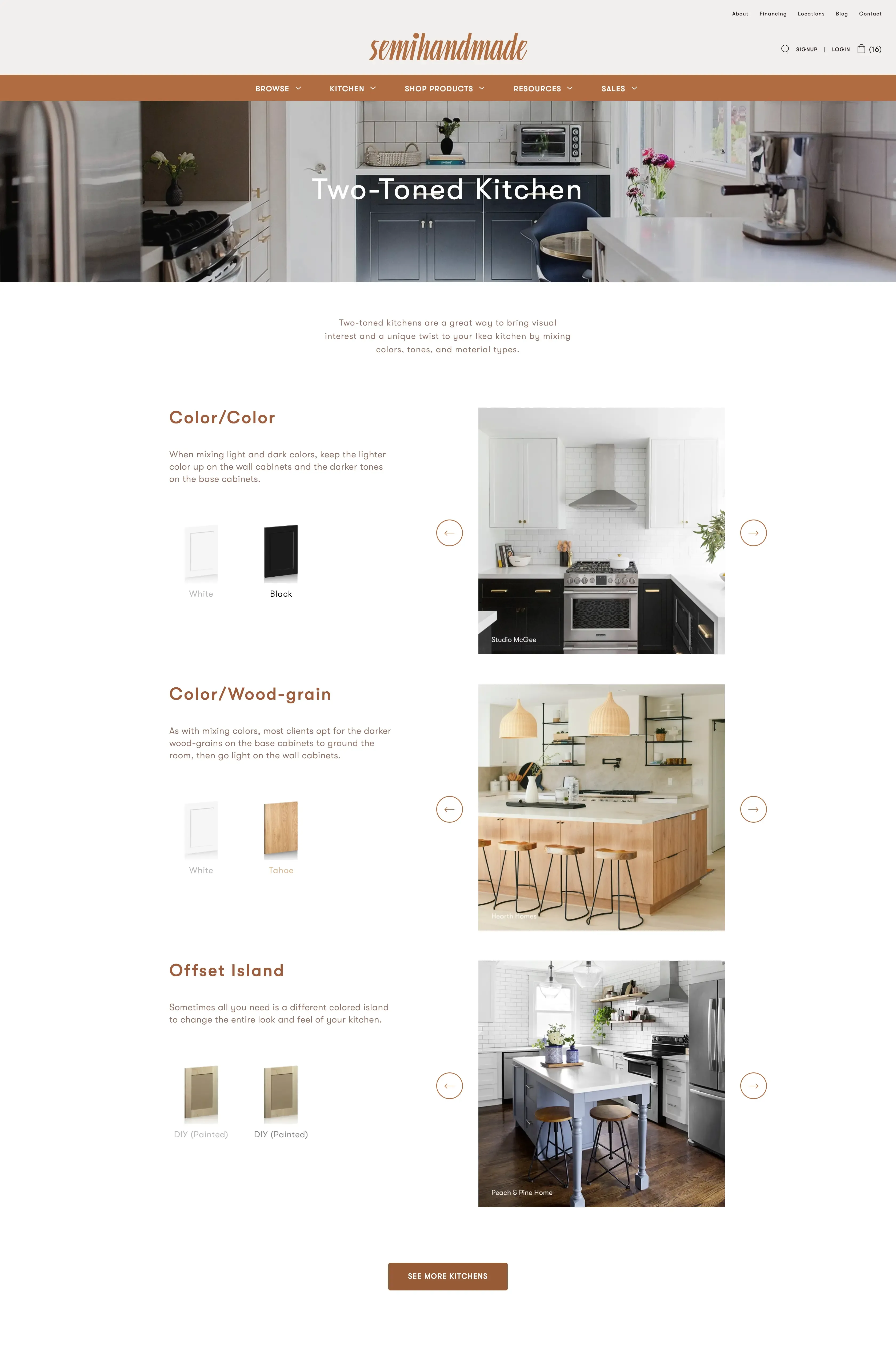
A custom solution with Smart Tags was designed for the site's backend to allow both Semihandmade and its customers to filter products in a guided number of combinations. Nico explained, It was a lot of work from the coding and inventory management perspective, but this is what defines and sets the user experience.
Smart Tags
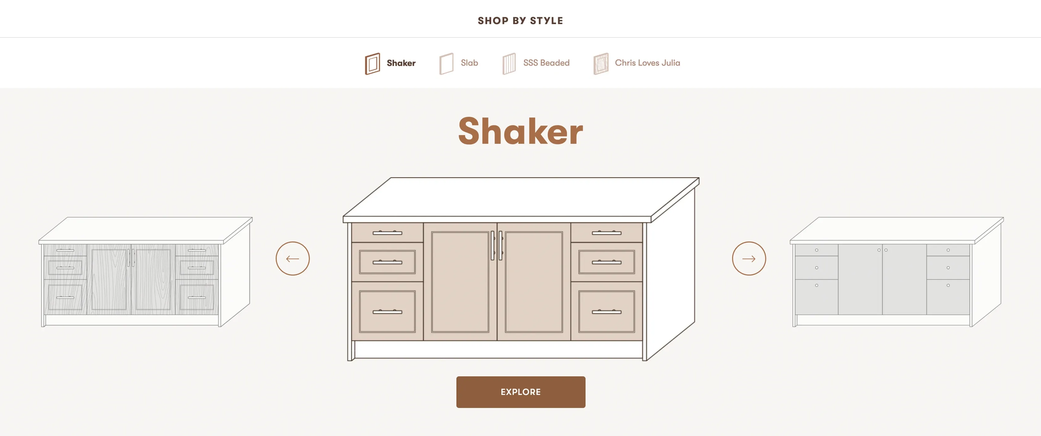
The idea of using the smart tagging system within Shopify was born from the Semihandmade's desire to improve their customer experience. Smart Tags allow for smarter filtering, interaction with products, and are easy to manage. Clients can manage directly in their regular Shopify Backend or by our team when we handle inventory on their behalf.
The Smart Tags system allows Semihandmade to provide a simple and intuitive solution for customers shopping for their dream kitchen online. The vast quantity of options with traditional online retailers can be overwhelming, with Smart Tags Semihandmade customers can easily select doors, drawers, trims, and panels based on the model, style, and color. It could not be simpler.
Experiment with the power of Smart Tags first hand. Shop your dream Kitchen with Semihandmade.
A whole new look and feel
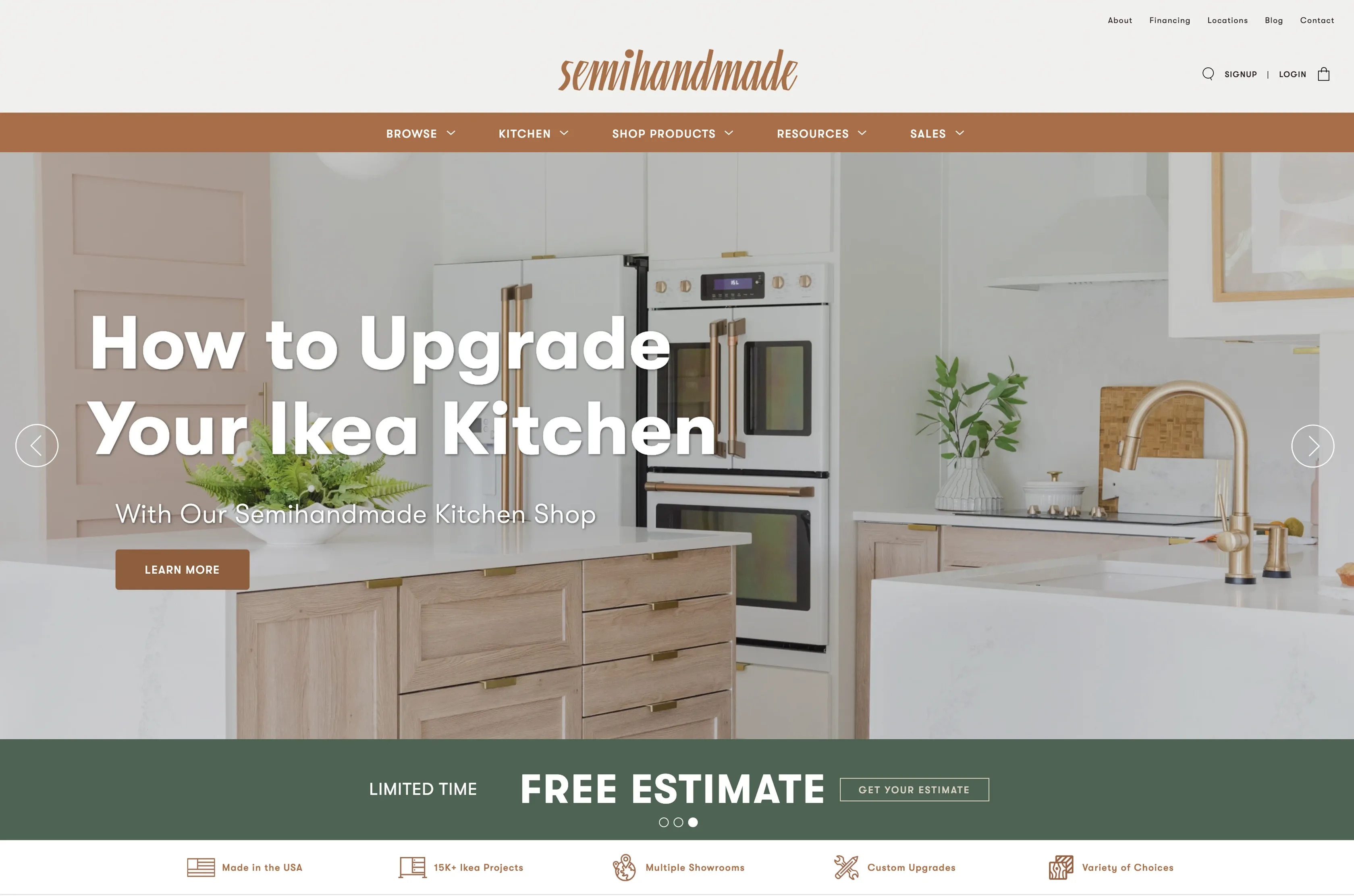
Once the site had been organized, it was time to apply the new branding Semihandmade provided. This work included the integration of the standard colors, fonts, and imagery updates, to the new store design and responsiveness for mobile and desktop.
As Nico clarifies, This is where Bluedge USA's experience really came into play. By presenting multiple design options early in the process and determining what Semihandmade liked, we were able to give an educated recommendation on what would serve them best while following the wireframes as blueprints.
Making things more interesting
A recurring issue in e-commerce is thin product page content. A product page with only a couple of pictures, a price, and a two-line description does not engage potential consumers. Additionally, not having the right content can hurt Search Engine ranking and diminish the opportunity for customer conversion and follow-through of purchase.
Working with Semihandmade we designed rich product page content and gave them the ability to edit it in the backend and answer consumer questions on each product page. The less pain points, the better the conversion rate.
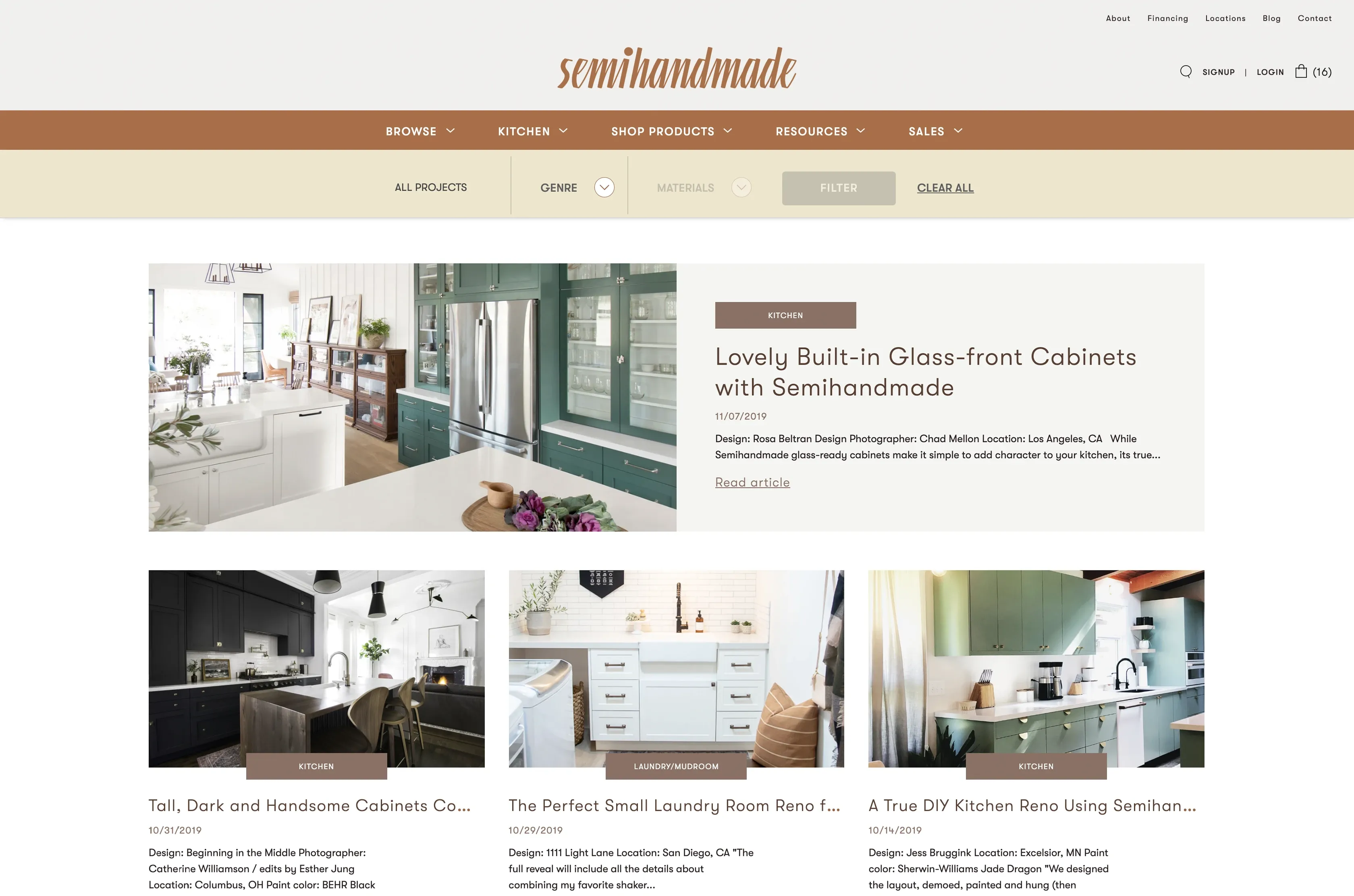
Filtering kitchen doors with Smart Tags made sense for the consumer buying journey, but we also saw an opportunity to stand out in the research that typically happens before purchase. We applied Smart Tags to the Semihandmade blog articles to offer readers an intuitive way to filter articles, past projects based on their style and material preferences. Rich blog filtering options definitively made the content discovery easier and more convincing for the readers.
Pushing the technical limits and creating a truly responsive design
A device oriented experience
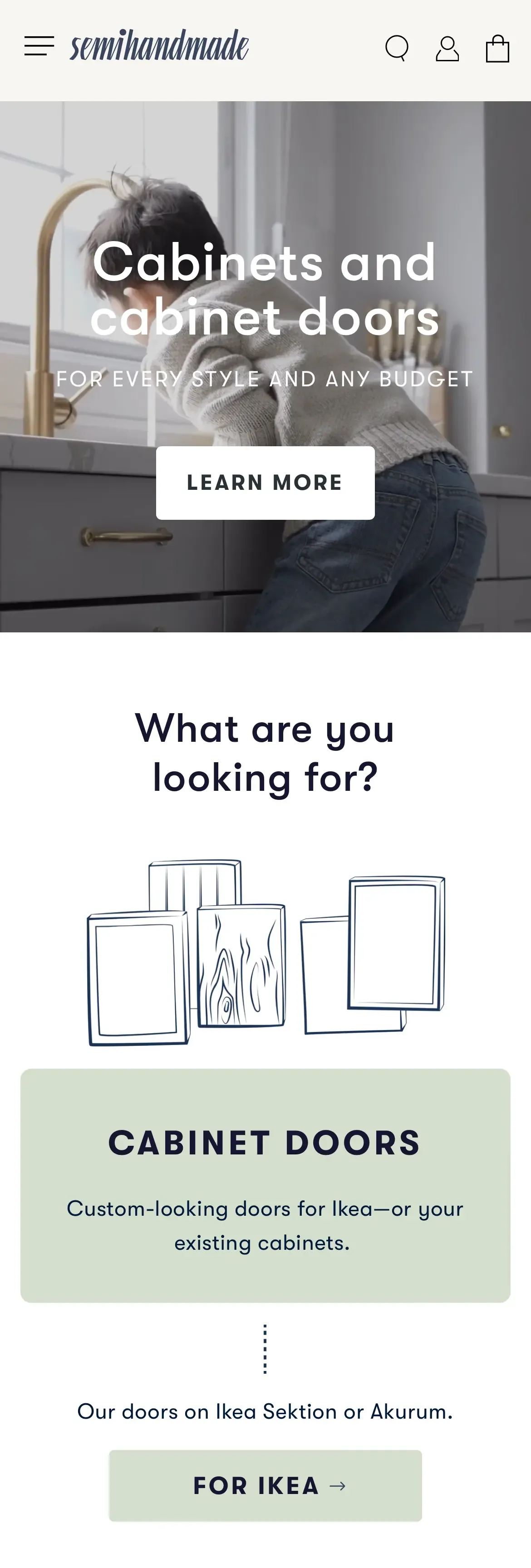
With such a large inventory to choose from, Bluedge's goal was to make the purchase process as seamless as possible, whether ordering via mobile or desktop. We paid attention to how users would be using the site to build their cart, what made sense for them, and how to keep the speed optimized, says Nico.
Semihandmade agrees. Since what we're trying to do is help customers create spaces in their homes that reflect their own style in an easy, intuitive and customizable way online, we really pushed the Bluedge USA team to help us create systems that allowed for complex collections, discounts, kits, and orders.
Proper filtering was going to be key in letting Semihandmade's customers not only find exactly what they were looking for but in leading them all the way through to the checkout. This involved not only a smart design but a real understanding of the platform's functionality. I've also felt one of Bluedge USA's strengths is their ability to educate my team on the Shopify platform and the logic behind e-commerce best practices, so we can make better decisions.
The user experience is paramount
E-commerce is for more than 60% of the users a mobile experience. Having a responsive design goes well beyond having a page properly displaying on a mobile screen. It is about ensuring a specific experience to mobile users, sometimes different from the desktop version. This is crucial to conversion rates when a small improvement can translate to a seven-figure increase in sales at the end of the year.
We also didn't only focus on the user experience and the aesthetic for mobile and larger screens; we focused on speed. Speed is paramount when you want thousands of customers to easily order from a variety of screen sizes and devices.
We decided that giving Semihandmade's customers the ability to easily order their dream kitchen was not enough, it needed to be very fast, even with an advanced system like the Smart Tags.
How it works? The most technical will appreciate the elegance of the system, while the less technical will enjoy its apparent simplicity. We created a system that will silently fetch all the data that any customers could ever need to filter and select the items they are looking for on semihandmade.com.
The Shopify website will store in the customer's browser the thousands of pieces of information at the first visit. Did you know your favorite browser is also intended to be used as a database to store useful information? Amazingly, all modern browsers are built with this feature and are very good at collating data.
As a result, everything happens effortlessly, in the background, and saves the user hundreds of seconds of data fetching while using the website to remodel their entire kitchen. All the information is already there and loads in less than 2/10th of a second at once.
How we used Shopify Plus to help Semihandmade enter the next level of e-commerce
Automatic Tiered Pricing Discounts in the cart
Thanks to the Shopify Scripts we could develop advanced logic that will apply differently discount percentages based on the following elements:
- Customer type: Individual vs Professional.
- Discount per product category for each customer type
- Exclusion of certain products
- Special discounts for selected items
The tiered pricing is extremely interesting for two reasons. The discount applies without having to manage additional discount codes, and this also eliminates the tedious task of communicating many discount codes to different types of customers.
The second direct benefit of Shopify Scripts applied to Tiered Pricing where different discounts were applied to customer carts based on cart sizes. This is a great way to give consumers an incentive to add more products to their order and take advantage of a higher discount.

Automation with Shopify Flow
Semihandmade prides themselves on their customer experience, and as the business grows, the customer service team needed to become more agile in identifying customers and opportunities. Shopify Flow became a great tool to save time and automate customer account tagging based on various criteria. The possibilities are endless, and the benefits tremendous for every department involved in providing the best service to the customers.
Custom reports
Shopify Plus comes with a variety of advanced reports that are a great source of data for your marketing and finance departments. Semihandmade expressed the need for reports that were unique to their business and data model. With the help of their Shopify Plus Manager, we were able to identify the needs and solutions to start creating custom reports that were used by stakeholders of the company.
Custom Checkout
Semihandmade wanted to offer truly exceptional customer service and partnered with Bread, to offer to their client's personalized payment solutions. In addition to offering direct payment installment calculation on each product page, Semihandmade wanted to fully integrate the payment service at the cart level. We were able to build a custom checkout page integrating the financing tool and help more customers acquire their dream kitchen.
Going live
It all gets coded and checked (again, and again)
Once everything was in place, the site could be built. To keep the site responsive and still easily updated by anyone on the backend, Bluedge USA created a custom solution for Semihandmade. Making the best use of the Shopify Plus e-commerce platform.
Bluedge USA were always thinking two-steps ahead. They build tools and site functions that allow us to control our site, without always needing to go back to them for the little things said Brian of Semihandmade.
We had to develop truly remarkable solutions for them, stated Nico, once completed, it was all about quality assurance on the development side. We did at least two weeks of quality control, making sure everything was perfect one by one. It was just details at this point, but it's an essential step in the process. By keeping an open channel between the teams, both sides were easily able to communicate any changes in a positive way.
Pushing the new e-store live
We launched the site at 4 am, by pushing the site live early when there are fewer users online in any US time zone. Bluedge USA was able to do last minute control checks without fear of it affecting Semihandmade's business.
Brian recalls that morning vividly, My internal team was gathered in a virtual war room with Bluedge as we pushed the code to a preview theme before switching live. It was exciting and required both an incredible amount of attention, but also quick responsiveness, as we were making sure things were flowing smoothly before going live. There was a mix of anxious anticipation followed by a big sigh of relief when we hit the publish button, and the new site went live. The response both internally and externally was resoundingly positive. We knew we had a great site.
A store as a living thing
One of our biggest takeaways from the site relaunch is that our site is a growing, living thing says Brian.
Our previous working model was focused on building out functionality reactively, on an as-needed basis. But working with the Bluedge USA team, we were able to shift to a proactive iterative model, which has changed the way we look at site development. To understand that it will constantly be evolving.
By combining stunning design, advanced custom solutions, and the flexibility on the Shopify Plus platform, Semihandmade's website continues to grow and reflect their ever-expanding needs.
When it's time to invest in the next level of the e-commerce experience for your customers, the L.A.-based Bluedge USA Shopify agency is here to act as your e-commerce partner and guide to help you reach your business objectives. Tell us about your next project.
